Categories
Highlights

Tumblr in Web Search Experiment

Explored ways to feature relevant, engaging Tumblr content in Yahoo web search results.

Screenshot of Tumblr search results experience for query "Charleston" sometime after the horrific church shooting
Tumblr in Yahoo Search results (no longer live)

Ask
After Yahoo acquired Tumblr, Search leadership asked me to find a way to feature Tumblr content in web search results.

Process
I started out with several things to consider:

  • Understanding the type of content on Tumblr
  • Determining what content, if any, could map to real web search user needs
  • Figuring out what metadata we could extract from Tumblr posts and whether it was enough to work well in our content management platform
  • Learning as much as we could from what little data the Tumblr team could share with us

Because I was unable to discover much evidence of existing Yahoo search-to-Tumblr content behavior in our logs, and the nature of Tumblr’s content is freewheeling and relatively unstructured, we had to experiment.

The first test featured content from specific Tumblr users (celebrities, online personalities, organizations–entities with discrete matching queries) in a simple image carousel. Limitations of this approach: only image-type posts could be displayed, so blogs with text posts, links, etc. would appear with limited results or none at all, despite frequent updating; we could only trigger on keywords that had a clear match to a single blog (e.g., Beyonce, ZooBorns). As a result, coverage was low, and leadership tasked us with significantly expanding the experience.

“[Emily] took on a very demanding team that wanted to create a new experience for users with Tumblr content. She patiently worked with the team and in many instances stepped in to help move the project forward. Without her it would have taken much longer to launch the experience on Search.”

Product Manager, Search

To accomplish this, I needed to rely on automatic triggering methods that offered far less control over what content appeared in search results. Despite concerns about relevance and quality, we launched a test for a small percentage of search traffic. The initial test had to be taken offline within days because, although the backend team took steps to remove content flagged as “adult,” pornographic results (and worse) slipped through.

Search leadership was determined, however, and resources were provided to dramatically improve the indexing for quality and cleanliness. The backend team also added logic for when to return content at all, based on timeliness and other factors. A visual designer was brought in to collaborate a unique template for Tumblr that accounted for the variable types of content and included more Tumblr branding (color, logos). The UX and content improvements launched as a test for a small percentage of search traffic, and although metrics weren’t impressive, it didn’t cause major problems, and the feature launched for all desktop web traffic.

“Emily did an outstanding job on the Tumblr [search experience] presentation for the Tumblr team. She has built a [search experience] that puts a stake in the ground until Science can develop more precise triggering.”

Product Marketing Manager, Search

Seeking to experiment further in hopes of improving and better understanding its performance, I took the initiative to categorize queries that triggered the Tumblr module and identify categories that might be well-served with Tumblr content. I used existing keyword lists roughly mapping to a dozen or so categories and set up a test bucket version of the module with only these categories with logging for each. I also wanted to see if other factors affected performance, including where the module appeared on the page (“slotting”) and how consistently it appeared (whether to ignore backend display logic). I tracked and compared my experiment’s performance to the primary module’s on a weekly basis, using that data to make small tweaks to each category along the way.

Result
The great Tumblr in search experiment ended after about a year and a half, when leadership decided the investment was no longer justifiable. Despite the effort’s ultimate failure, I was recognized for my contribution and creativity.

Key categories in my final experiment did show some lift in performance: food, books, holidays, fictional characters, TV series, and movie series.

Categories
Highlights

Social Media Survey Research Plan

For my graduate-level survey research methods course, I devised a questionnaire and research proposal to investigate attitudes about personal disclosure and privacy on different social media platforms, especially among gender diverse people. I hypothesized that individuals with marginalized identities, including transgender people, would be more likely to either disguise or hide aspects of their identity or share less personal information on social media sites where those identities and/or perspectives put them at greater risk for harm, such as abuse, threats, or career problems.

As a solo project, I was responsible for developing the questionnaire, performing background research, and writing the proposal. Throughout the project, I consulted with my classmates, instructor, and external contacts to test and improve the survey instrument and overall research direction. To explore my research question, I knew I needed to collect survey data on two key areas: social media use and demographics. The specific question and answer sets for each were informed by background research, in particular several previous scholarly studies of social media and identity, as well as general knowledge of survey design best practices. 

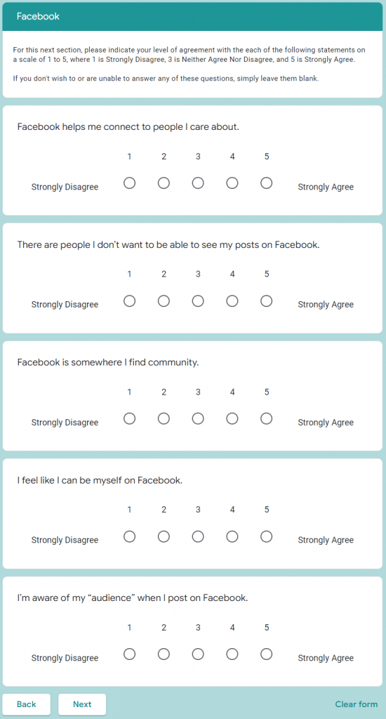
There were three sections of social media questions, one each for Twitter, Instagram, and Facebook, each with nearly identical question and answer sets (UI copy and functionality differences between the sites reflected) so they could be directly compared. Each section began by asking respondents how often they used a given social media platform and only those who selected “I use it once a week or more often” were shown the following question set. The questions for each platform were divided into two pages to reduce participant fatigue. The first page asked participants about the type of information they share about themselves and their interests and what kind of privacy settings they use. The second, shorter page asked users to rate their agreement with five statements on a 5-point agreement scale. These statements were particularly influenced by previous research about online privacy concerns and community.

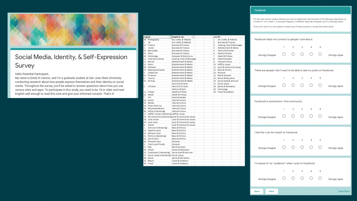
Screenshot of agreement questions from Facebook section of survey

For demographics, I wanted to include more aspects of identity than just my area of focus (gender) without seeming too invasive, as well as deliberating excluding answers that might identify respondents. Age was asked as a set of ranges; disability status was a simple yes/no; most questions allowed for multiple selections and every item could be skipped or marked “Prefer not to answer.” “Other” with a text field was an option for many questions, but I aimed to design the questionnaire so most respondents could easily answer without writing anything.

According to feedback from peers and survey testers, I mostly succeeded in my goal to write an easy-to-answer questionnaire that gave respondents options they felt described themselves and their point of view. Data collected with this instrument would have been readily analyzed and compared with (hopefully) minimal manual coding.

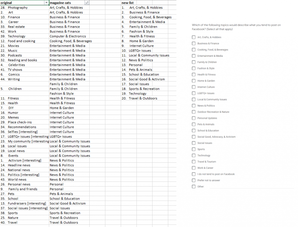
An important challenge I faced when designing this questionnaire involved writing questions and answers that were complete, accurate, AND readily answered without being time-consuming. Some of my questions asked users to recall information they might not have in mind, such as profile fields they completed. In an effort to eliminate open-ended questions entirely, I made a list of topics that people might post about, which started out very long (40 or so items) and ended up with 22 named topics, 14 of which combined two or more related topics. These labels might not have been a great fit for many respondents’ mental model of their interests, and I heard feedback from survey testers that they were confused about which boxes to check for more specific interests they had in mind. Additional user testing prior to launching the study would be ideal. Additionally, had I moved forward with this proposal, a key concern would be sampling–gender identity is not a screening question, nor can a gender diverse population be effectively quantified for the sake of random sampling techniques, so careful, targeted recruitment would be necessary to attract respondents with marginalized identities.

Screenshot of a spreadsheet with work-in-progress topic labels next to screenshot of question as it appeared in the survey

Research proposal and questionnaire (PDF) on Google Drive

Throughout this process, it was a pleasure to reconnect with survey research and quantitative analysis skills I first honed working in market research once upon a time. I learned quite a bit about the existing body of research about user behaviors and attitudes toward social media. We sometimes think of this as an emerging field, but relevant studies go back at least 20 years to online forums, newsgroups, and early social media like Friendster. It reinforced my desire to incorporate intersectionality and inclusion principles in my work as much as possible, which is why I did not opt to limit the study to participants of a particular gender identity and instead collect demographics that may reflect multiple oppressions to better contextualize my (proposed) findings.

/ iSchool, Portfolio, research, writing

Categories
Highlights

UX Evaluation & Prototyping: Recipe Search

For my graduate-level web usability course, I completed a solo project that explored a design problem and its possible solutions. I hypothesized that a key problem with recipe search experiences is the discoverability and ease of using filters so users could easily sift through recipes irrelevant to them based on ingredients, diet, style, or other factors. I focused on Yummly.com, a recipe search tool that already offers many of these filters, but could use improvements in some aspects of the user experience.

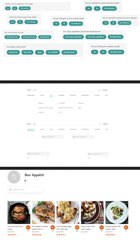
Compilation of annotated screenshots highlighting possible UX issues with top recipe search experiences
Screenshot of notes from informal user interviews collected via Instagram direct messages

Without a budget or resources for in-depth user research, I reached out to my personal network via Instagram to solicit feedback on recipe search experiences, including what they use to find recipes and their frustrations with recipe search. After identifying key user concerns, I performed competitive analysis of top recipe sites and identified their strengths and weaknesses. Based on this background research, I devised a list of potential user interface changes, taking heavy inspiration from Jenifer Tidwell’s Designing Interfaces patterns. These included a clear entry point the filter wizard to make this feature more prominent; adding modules for features results and suggested filters within the search results to enhance discovery and help users struggling with too many results; and using modal panels (popover windows) for filters, results, and source pages to address the problem with jumping users out of the search results without any way back. I also designed a “favorite site” feature that, in conjunction with an existing “saved recipes” function, could help personalize results for logged-in users.

Screenshot featuring multiple slides with prototype components

I faced significant challenges while working on this project, not least because it happened during Spring 2020 and COVID-19 restrictions severely limited my ability to perform prototype testing. Although the assignment only called for paper prototypes, at the time, I found it easier to use PowerPoint to develop a high-fidelity clickable prototype using screenshots, shapes/text, and embedded links to other slides to simulate clicking and scrolling. I had not yet become acquainted with professional wireframing tools and my instructor did not encourage remote user testing, so I could only test the experience with my partner.

Even this limited testing suggested a number of changes for a second iteration of the prototype and was an informative experience. Overall, as a first attempt at a solo user research and testing initiative, I learned quite a bit about how much I have to learn from other people–even people who are relatively “similar” to me–and that even relatively small-looking design iterations require thorough consideration. I also really enjoyed the process. Details of my process, findings, testing, and learning reflection can all be found in the linked report.

Categories
Highlights

Redesign Proposal: Gardening Information & eCommerce Website

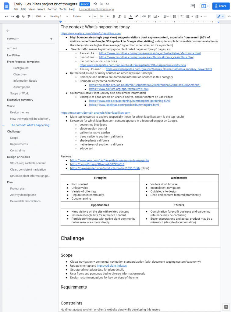
For my graduate-level information architecture course, I teamed up remotely with two classmates to complete a semester-long design proposal with several distinct components and deliverables, including content and business strategy, content inventory, user research plan and initial card sort task results, personas, and mock-ups or wireframes. We chose to focus on the website of the family-run California native plant nursery Las Pilitas, a treasure trove of information about gardening and nature that appears among the top Google search results for queries relevant to its somewhat niche interests, but suffers from navigation and wayfinding issues. Based on the publicly available SEO data we could find, we posited that a relatively high bounce rate reflected this poor navigation, meaning users landed on a particular page, such as a page about a popular plant family, but did not explore image galleries, information about specific varieties of the plant, advice about landscaping with these plants, and so on.

Screenshot of my early research notes

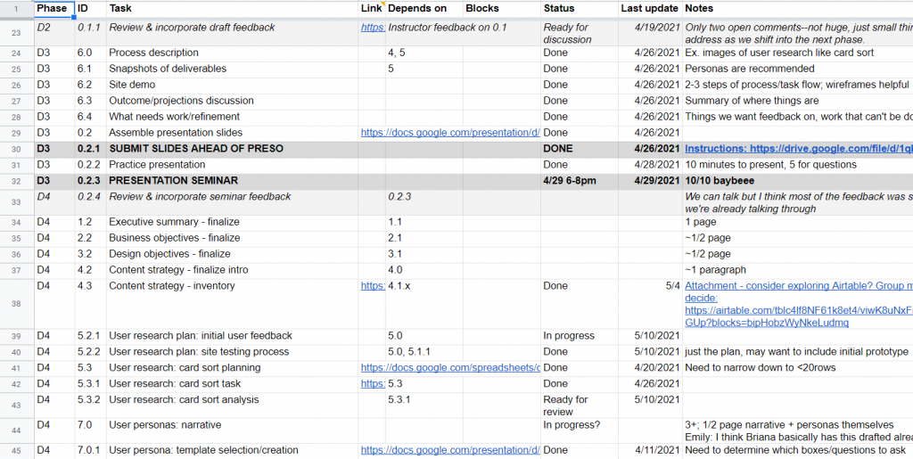
As students, my teammates and I balanced responsibilities in order to maximize learning, as the project was an opportunity to practice a variety of skills and gain experience with new tools. I created all the wireframes in Balsamiq; developed our content inventory process in Airtable; designed the report, personas, and and slides; performed competitive and background research; drew the final version of the site map diagram; and did light project management/tracking in a simple spreadsheet.

Screenshot of a portion of our project tracking spreadsheet

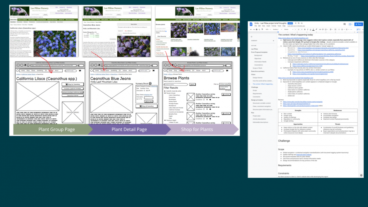
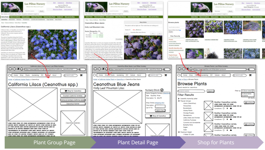
Based on content inventory and competitive research, we knew we needed to improve the site’s overall organization for more meaningful breadcrumbs to give visitors entering via web search a sense of where they’re at and what else they might explore. We expected this would also support effective “related” links on deep nodes like plant detail pages. Additionally, we wanted to explore modernizing the global navigation bar with a fat menu design. We tested a number of possible user flows on the existing site and noted pain points to accomplishing common user goals like making a purchase or finding plant information, which informed several smaller decisions in terms of buttons, tooltips, search interface, and media experience.

Since this was a student project with no client contact or budget for in-depth user research, we were limited in our scope. The wireframes, labels, and personas are all effectively a first iteration and would undoubtedly evolve over the course of doing real client-contracted work. In particular, I’d like to be able to see site analytics and search traffic data to more effectively identify important entry points and stress cases for visitors and customers. Additionally, the content library is enormous, far too many documents to cover for our project, but a thorough accounting of the site’s content and how it’s internally linked would be an important starting point for a site redesign.

User flow from entry point (plant group page) to a plant detail (product) page to shopping experience comparing existing experience with proposed redesign wireframes

Translating ideas and inspiration to a coherent mock-up requires creativity and a clear sense of your users and the product. We realized that, for as much as we could do on spec, our work would only really be actionable after we could address the limitations. Despite that, the team benefitted from the collaborative design process overall and enjoyed learning new tools, like Balsamiq, Lucidchart, and Airtable, to make design ideas tangible.